Claude Dashboards from a CSV: we tested it on Max, and the numbers were right
One prompt turned a sample sales CSV into a filterable Claude dashboard in about 4.5 minutes. Every figure matched our own calculation, but it doesn't refresh when the file changes.
By the RanThis team, written with AI assistance6 min read
Why trust this: every result, number and screenshot comes from a real run on our own accounts, not from the AI. How we test
Yes, Claude Dashboards can build a working dashboard from a plain CSV file, even though Anthropic's help page only talks about data warehouses and connected apps. We tried it on a Claude Max plan: one prompt and about four and a half minutes later we had KPI cards, three charts and a region filter, and every number matched our own calculation. The catch: it does not refresh when your file changes.
Tested on 16 October 2026 on claude.ai with a Claude Max plan (Opus 5.5, Medium effort), in Chrome. The CSV is made-up sample data: 60 rows of weekly sales by region and product.
What Claude Dashboards is, and who has it
Anthropic describes Dashboards as a way to have Claude build interactive dashboards from your data. Per its help article, it is in beta on the Pro, Max, Team and Enterprise plans, not on Free, and on Enterprise it is off until an owner turns it on. The data sources it lists are data warehouses (Redshift, BigQuery, ClickHouse, Databricks, Snowflake) and connected apps. CSV files aren't mentioned.
On our Max account there was no Dashboards menu item and no feature-preview switch: nothing in the sidebar, nothing when we searched Settings for "preview", and claude.ai/dashboards returned "Page not found". You get it by asking for a dashboard in a normal chat. Claude then creates an artifact labelled Dashboard.
Hands-on test
The test: a CSV and one prompt
Our file had columns date, region, product, units, revenue, cost: four regions, three products, eight weeks from 6 July to 24 August. We attached it to a new chat and typed:
Build a dashboard from this CSV: weekly revenue trend, revenue by region, margin by product, and a filter for region.
Claude first calculated the figures in its code sandbox ("Numbers check out"), then built the dashboard. Total time from sending the prompt to a finished dashboard: about 4 minutes 30 seconds.
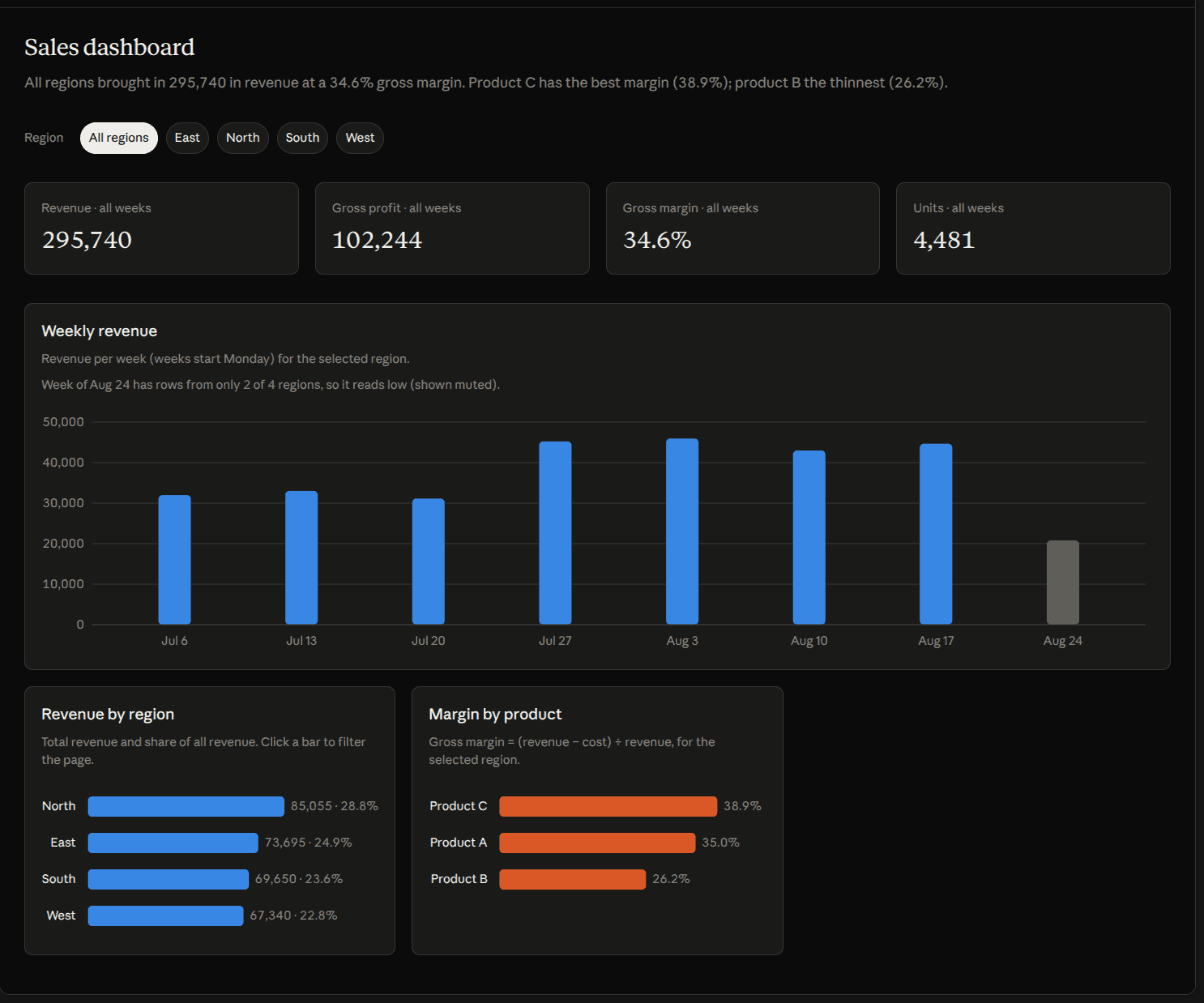
What we got:
- Four KPI cards: revenue, gross profit, gross margin, units.
- Weekly revenue as a bar chart. We asked for a trend; it chose bars, not a line.
- Revenue by region, where clicking a bar filters the whole page, plus a row of region chips (All, East, North, South, West).
- Margin by product, with the formula written under the title.
It also caught a problem in our data. The last week had rows for only 2 of the 4 regions (a side effect of how we trimmed the sample file). Claude greyed that bar out and added a note that the week "reads low" because regions are missing.
Are the numbers right?
We recalculated everything from the CSV in Python. All of it matched: total revenue 295,740, gross profit 102,244, margin 34.6%, units 4,481; by region North 85,055, East 73,695, South 69,650, West 67,340; product margins C 38.9%, A 35.0%, B 26.2%; and every weekly total.
The region filter matched too. With East selected: revenue 73,695, profit 25,810, margin 35.0%, units 1,148.
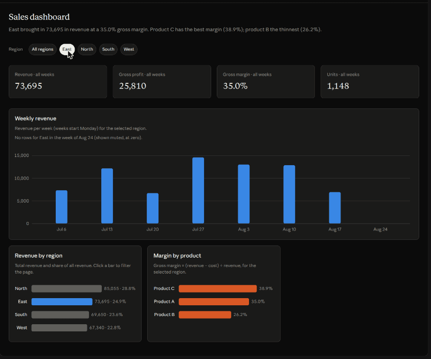
The margin-by-product chart didn't change when we filtered by region. That is correct for this sample: each product has a fixed price and cost in our data, so its margin is the same everywhere.
Changing the data: no automatic refresh
We edited one row (North, product B, week of 6 July: units 70 to 570, revenue 4,550 to 37,050) and re-uploaded the file. The dashboard did not update by itself. We had to ask:
I changed one row. Update the dashboard with this new CSV instead.
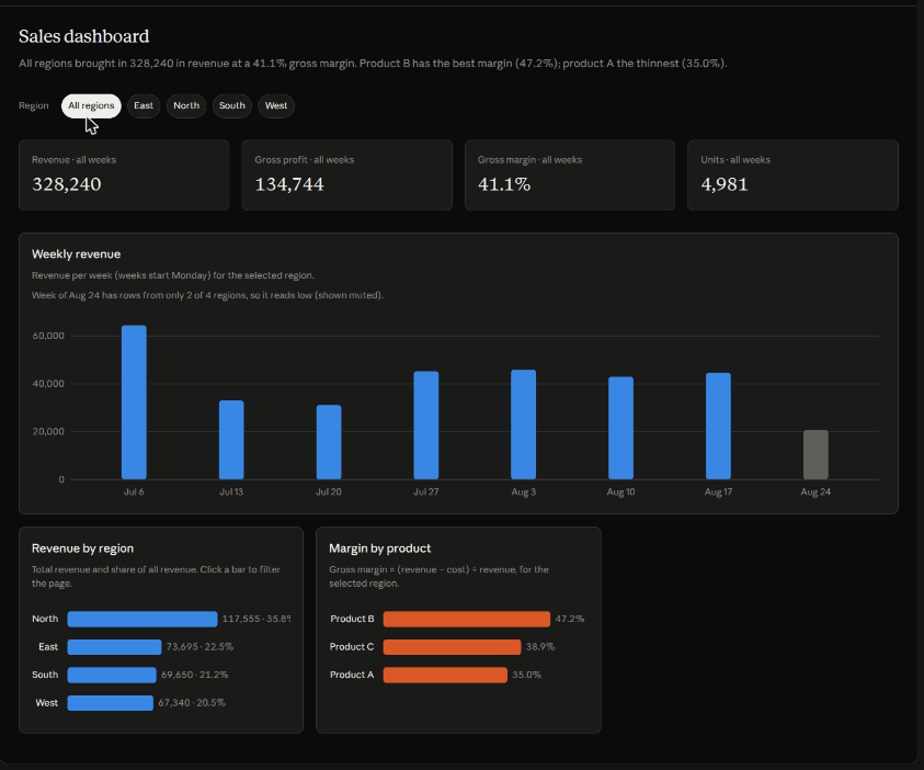
Claude asked permission to run a command in its sandbox (we clicked Allow once), compared the two files, named the exact row that changed, and switched the data source in about 45 seconds. The new totals were right again: revenue 328,240, North 117,555, product B margin up to 47.2%.
Live data needs a connector
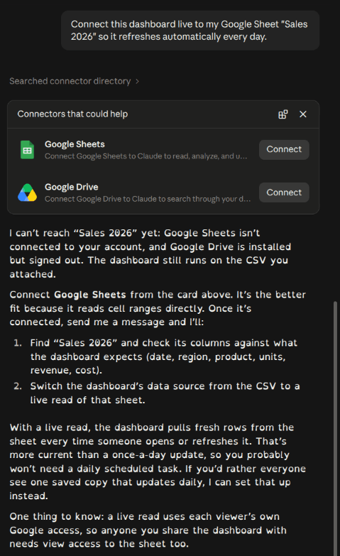
Next we asked: "Connect this dashboard live to my Google Sheet "Sales 2026" so it refreshes automatically every day." Claude said it couldn't reach the sheet because Google Sheets wasn't connected, showed Connect cards for Google Sheets and Google Drive, and explained the plan: once connected, it would switch the data source to a live read of the sheet, refreshed whenever someone opens the dashboard. It also warned that a live read uses each viewer's own Google access, so people you share it with need access to the sheet too. We didn't connect anything.
Sharing and export
The dashboard was saved as an artifact, private by default ("Only you"), with options to invite people or copy a private link. Claude warned that the attached CSV goes with the dashboard, so anyone you share it with can read the whole file. The Share panel also had an Export tab listing analytics tools to push the dashboard to, such as Amplitude, Datadog, Grafana Cloud, Hex and Mixpanel. We didn't see a PNG or PDF export there.
Verdict
- Good for: a quick, accurate, filterable view of a CSV you already have, with no BI tool. The figures were right everywhere we checked, and it spotted the incomplete week.
- Not a live dashboard from a file: a new CSV means asking Claude to swap the source. For live data you need a connector or a warehouse.
- Watch the sharing: the raw CSV travels with the dashboard.
- Not tested: warehouses, large files, the Pro plan, and Claude Motion.
If you work in spreadsheets, see also our Claude for Excel test.
FAQ
Can Claude Dashboards use a CSV file?
Yes, in our test on a Max plan. Anthropic's help page only lists data warehouses and connected apps, but attaching a CSV in chat and asking for a dashboard worked, and the numbers were correct.
Which plans have Claude Dashboards?
Anthropic lists it in beta on Pro, Max, Team and Enterprise. Free doesn't have it, and Enterprise owners have to turn it on.
Where is the Dashboards button?
We didn't find one on Max: no sidebar item, no settings switch, and claude.ai/dashboards was a 404. Ask Claude for a dashboard in a chat and it creates a Dashboard artifact.
Does the dashboard update when my data changes?
Not from a file. You have to upload the new CSV and ask Claude to switch to it. With a connected source such as Google Sheets, Claude says the dashboard reads fresh data each time it's opened.
Sources
- Anthropic Help Center: Get started with Claude Dashboards
Vendor document
- Claude Blog: Article Oct 8, 2026 Build live dashboards and animate explainers with Claude Claude Dashboards and Claude Motion are now in beta. Docs, Slides, and Design are out of beta and on every Cla
Vendor page
- Anthropic – Claude pricing page (USD, before tax): Free/Pro/Max/Team, feature table, up to 1M context, no fixed message cap
Vendor page